Curie Brief
Turn on cookies to sign in
Signing in saves your progress to your Curie account. We can only do that with cookies on — turn them on to continue.
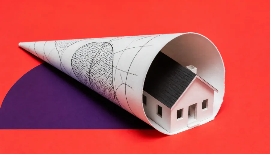
Upgraded hurricane forecast graphics help people spot threatened areas, but a new study finds they don't actually make people feel more at risk or more likely to act. Researchers also found that a longstanding misreading of the "cone of uncertainty" — where people mistake a wider cone for a bigger storm — stubbornly persists. Better science alone isn't enough if the communication doesn't drive action.
The National Hurricane Center (NHC) rolled out an updated forecast graphic in 2024, expanding the traditional hurricane cone to include inland tropical storm and hurricane watches and warnings. The goal: help people understand that dangerous storm conditions — flooding, tornadoes, destructive winds — don't stop at the coastline. But a new Florida State University study suggests the upgrade is only doing part of the job.
Researchers surveyed Florida and Georgia residents, showing them either the classic cone graphic or the new expanded version. While the updated map did help people identify inland watch areas more accurately, it didn't make them feel more personally at risk or more motivated to take protective action. And a stubborn misconception endured: many participants still interpreted a wider cone as a sign of a physically larger storm, rather than greater uncertainty in the storm's projected path.
Key Takeaways:
Why it matters: Accurate forecasts are only as effective as the public's response to them. If clearer maps don't translate into safer behavior, lives remain at risk — pointing to an urgent need for smarter, more actionable hurricane risk communication strategies.